 The Cover-Mate Desktop Charging Dock is made for LG and Samsung Smartphones. It should work with any phone with the Micro USB port on the bottom, and the wide end of the Micro USB plug facing the back of the phone.
As the name suggests, it is also able to work around a case. It will even work with thick cases like the ArmourDillo Hybrid Protective Case on the Nexus 4. When you place your phone on the charging dock, its weight will make small adjustments to the angle and height of where it sits.
This charging dock has a feeling of good build quality to it, for its price. It is made mostly from glossy plastic and, where the phone sits, matte plastic. There are two rubber feet on the bottom to stop it from sliding around.
This charging dock also comes with an extra Micro USB cable, in case you are using the cable you already have for something else. At around 1m in length, this cable will be far too short for some people to use. However, I think it is a nice touch.
There is one problem with this charging dock that can’t be easily avoided. When you are putting your phone on it, you have to hold the dock still and carefully place your phone on top of the Micro USB connector. This problem can be solved with wireless charging, and it does seem like something that will be used a lot more in the future. However, wireless chargers currently cost around £40, which is a bit steep. Besides that, most smartphones still don’t support wireless charging.
If you decide to buy this charging dock, I would recommend using it with care. Avoid using it on the edge of a table, or anywhere where the phone could get knocked to the ground. When the phone is on the charging dock, it is standing up and can be knocked down a lot more easily. I am mentioning this because even if your phone has a case on it, the screen of your smartphone can fall on top of the charging dock and get cracked.
This charging dock costs £19.95. I think it would be better priced at around £15. However, if you choose your next smartphone carefully, it should work with that dock. Because of that, the charging dock has good value for money overall. It can be bought from MobileFun.co.uk and MobileFun.com under Galaxy Note 2 accessories.
Posted on Tuesday 19th February 2013 - Leave a comment
The idea of using a stylus with a smartphone seems a little bit old fashioned today. Steve Jobs never liked them, and they were originally meant to make it easier to use old resistive touchscreens. As smartphones evolved to catch up with Apple’s iPhone, the stylus mostly died out. However, Samsung started their Galaxy Note series, with the S-Pen advertised as the main selling point. The Galaxy Note II is currently one of the most popular smartphones among the Android crowd, and it easily matches Google’s Nexus 4 with popularity. Clearly, the stylus hasn’t completely died out, and there are still several uses for one.
Using a good quality stylus is one of the best ways to prevent fingerprints on the screen of your smartphone. A stylus can also be used to draw quick pictures on your smartphone or tablet, to save paper. One of the best uses for a stylus is for when you are wearing gloves. Finally, a stylus might be used by someone who wants to use a smartphone, but isn’t used to touchscreens. Although most mobile software today uses buttons big enough for users to tap with their thumb, some people still find a stylus to be a more accurate pointing device.
The first problem I found with this stylus is its length. The stylus is too short to be used like a pen or a pencil, and it is awkwardly shaped, meaning there is only one way to hold it comfortably. It is possible to get used to the length of this stylus, and it is meant to be small. However, if this stylus was around half the length of a pen, it would still fit into nearly any pocket, and it would be a lot more comfortable to use.
Another problem with this stylus is that it leaves prints on a smartphone screen. If you are looking for a stylus specifically to avoid fingerprints, you will find stylus prints instead, and they are just as bad. This isn’t a big problem, as the marks can simply be wiped off. However, it is something to keep in mind.
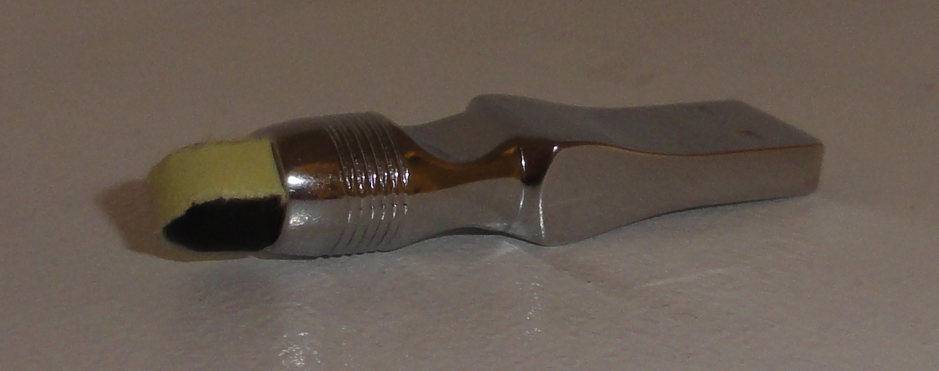
The biggest problem with this stylus is how it is made. The part used to touch the screen is covered in a thin layer of smooth plastic, to make it easier to use the stylus for swipe gestures. That layer of plastic started to peel off in about a day of regular use and some time in my pocket. Because of that, with too much swiping, the rubber tip at the end falls off. This problem can be solved by covering the end of the stylus with a thin strip of paper or sticky tape, but that way of fixing the problem makes the stylus look a bit cheap.
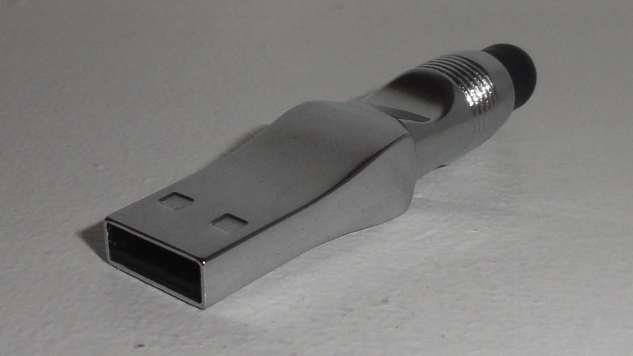
The other end of this stylus has a built in USB flash drive. This flash drive has 16GB to store your data, and it operates at a reasonably fast speed, only taking a few minutes to transfer around 1GB of data. It has always been impossible to have too many USB flash drives, and that is especially true today. Because of that, the USB flash drive adds a lot of value to this stylus.
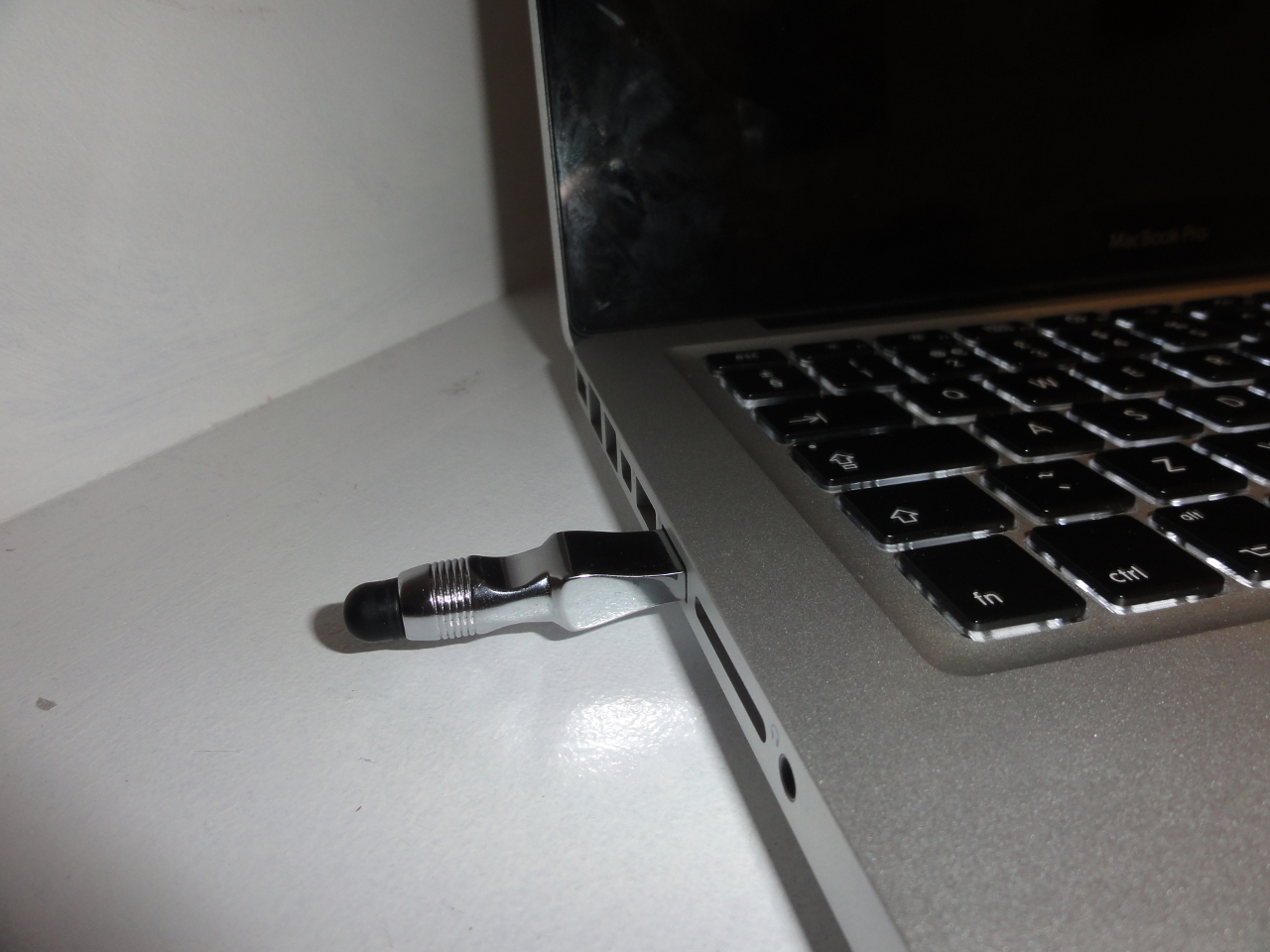
I would recommend this stylus for someone who just wants an accurate pointing device for their smartphone, or for someone who wears gloves a lot. I would not recommend this stylus for someone who won’t use the USB flash drive. Overall, this stylus is a good idea, and with the £15 price tag, it has good value for money. However, it could certainly be improved. This stylus can be bought from MobileFun.co.uk, under Galaxy Note 2 accessories.
Posted on Tuesday 12th February 2013 - 3 comments
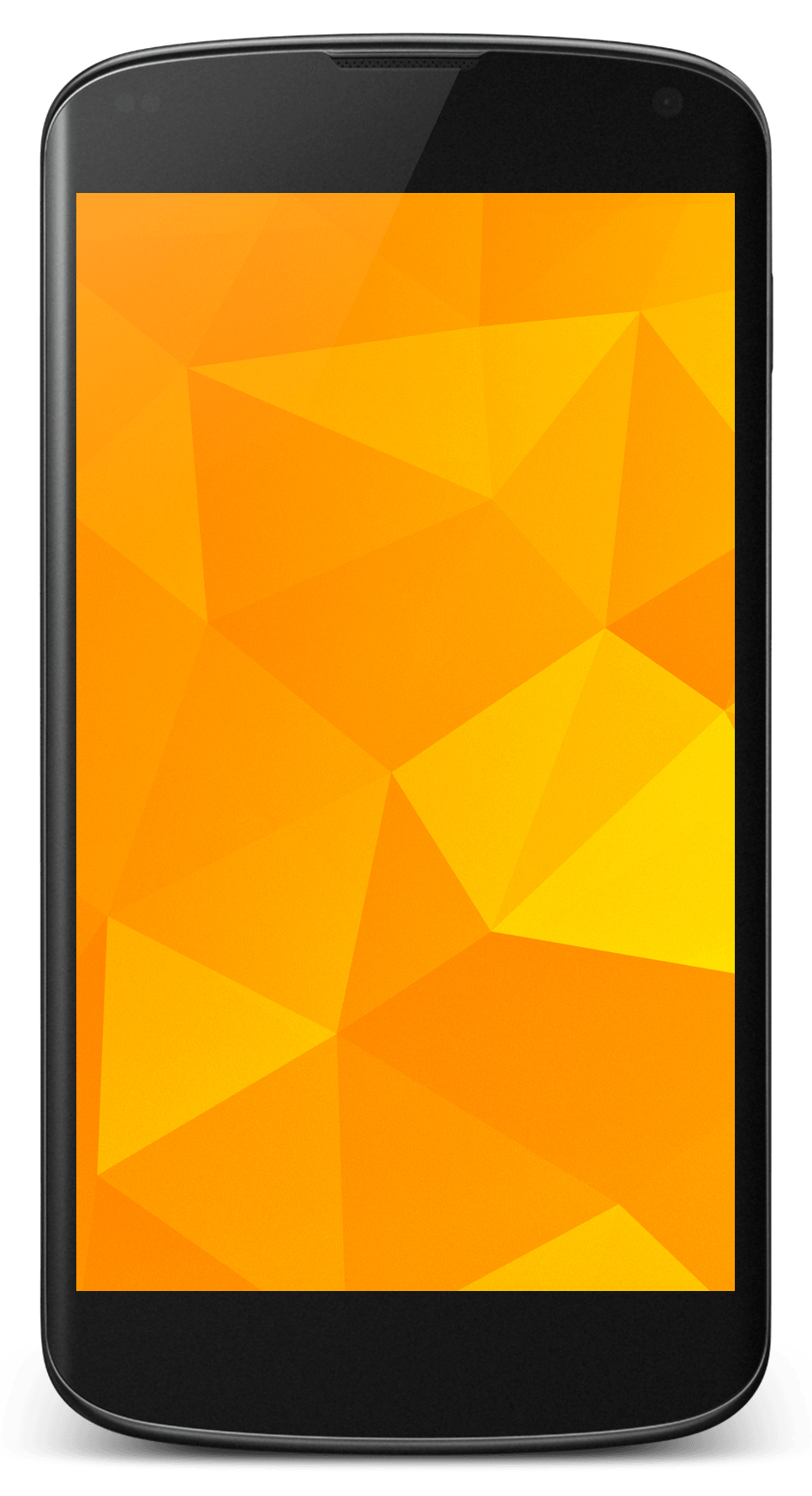 I chose the Nexus 4 over another smartphone for quite a few reasons. I chose it over an iPhone 5 because of how open it is to developers, and I chose it over an HTC One S for the attention it will get from the developer community. The on screen buttons are also pretty cool.
Unlocking the bootloader is really easy with a Nexus device. With the Android SDK installed on your computer, the bootloader of this phone can be unlocked with a simple Fastboot command:
fastboot oem unlock
And unlike many other Android devices, when a Nexus device is unlocked, all partitions are fully unlocked, meaning there is no need to use Fastboot to flash boot images to the phone with new ROMs.
The Nexus 4 is a developer’s phone. This means that, with the exception of Google Apps, all the software preinstalled on this phone is open source. Because of that, this phone will get plenty of attention from the developer community for years, and custom ROMs like CyanogenMod will become stable daily drivers almost immediately.
CyanogenMod was the first of the most well known custom ROMs to come to the Nexus 4, which means it has had the most time to mature and become stable. It gives you root access, as well as allowing you to make customisations to stock Android. It also comes with little goodies, such as Trebuchet Launcher and the Chronus clock widget.
AOKP development started after Google released Android 4.0 and the Galaxy Nexus in 2011. Like CyanogenMod, AOKP allows you to make changes to stock Android. It has more customisation features than CyanogenMod, which is why many people really like it. However, it doesn’t come with Trebuchet Launcher or the Chronus clock widget.
ParanoidAndroid is great for those who want something different on their phone. Basically, ParanoidAndroid allows you to use your phone like a tablet by moving the notifications to the bottom of the screen and scaling the graphics down. It allows you to specify which apps you want to run in tablet mode and which apps you want to use normally. Anyone with an unlocked Nexus 4 should give it a try, although I wouldn’t recommend it for someone with fat fingers.
In coming months, you can expect many other ROMs to come to the Nexus 4. I am currently waiting to see a version of MIUI for the Nexus 4, as I really like the look and feel. I also hope to see PAC-Man ROM, which basically combines the best features of the ROMs I mentioned above.
Posted on Wednesday 30th January 2013 - Leave a comment
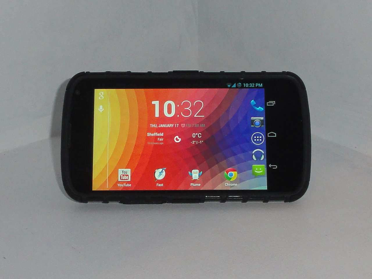
The ArmourDillo Hybrid Protective Case for the Nexus 4 is, as the name suggests, a rugged case that is made to protect the Nexus 4 from drops and bumps. This case comes in two parts; a flexible part that wraps around the back and edges of the phone, and a hard outer shell that covers the back and clings around the corners and two sides of your device. This case comes in red, blue and black.
The back of this case is not made for looks. However, although it doesn’t look as good as the glass back of the Nexus 4, it isn’t ugly either. The design of the back is made to provide good grip when holding the phone, and to ruggedise it. With this case, it doesn’t feel like I’m going to drop my phone, and I was also impressed to find that the case has a pleasant soft touch to it.
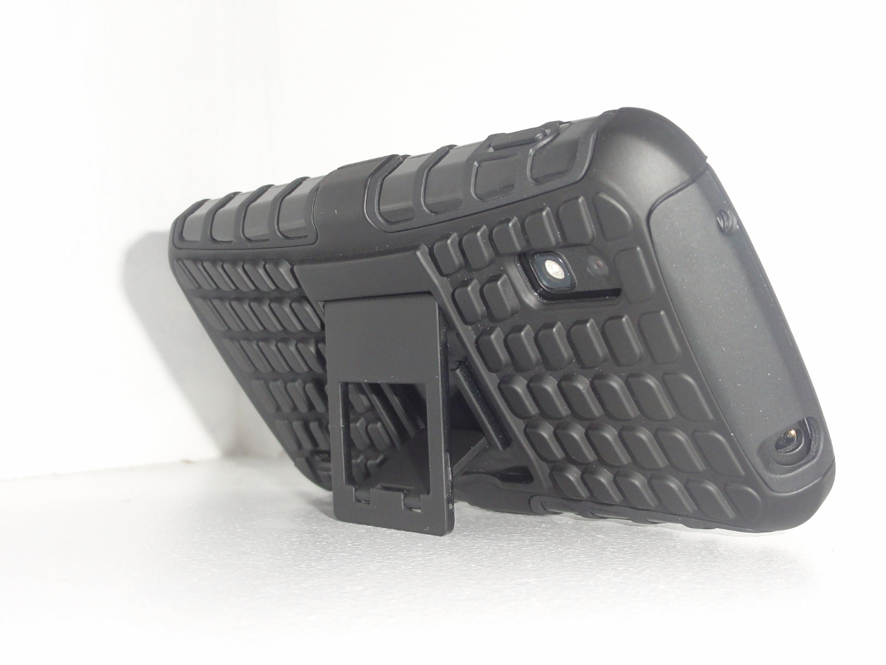
On the back of the case, there is a kickstand. The kickstand has to be opened with a finger nail. It also feels a bit cheap, and I think it could be broken off quite easily with a bit of abuse. However, it is a nice addition to the case, and if it is closed properly when it isn’t being used, it should last well.
One thing I didn’t like about the case is how the side buttons are covered. This is to provide maximum protection, and to keep the phone in good condition. However, the power button has to be pressed harder to wake the phone up and, although this isn’t a big problem, it takes some getting used to.
Another thing I didn’t like about this case is how the edges of it, at the front of the phone, go above the touchscreen. This makes it harder to swipe onto the screen from the left or right edge, a commonly used gesture in mobile apps. Of course, this is required to some extent with any case in order to protect the screen from drops. However, the edge only needs to be raised a little bit to protect the screen from drops on flat surfaces.
One thing to think about with any case is the amount of thickness it adds to the phone. This case nearly doubles the phone’s thickness. However, while this may be a problem to some people, it isn’t a problem to me. The Nexus 4 is quite a thin phone, and with the case on, it doesn’t feel that much thicker in the hand.
Overall, the ArourDillo Hybrid Protective Case is one of the better cases in its price range. I would recommend this case for anyone. Particularly, someone who wants to protect their phone, and who doesn’t mind imperfections like the added thickness. I would also recommend this case for someone who watches a lot of videos on their phone, because of the kickstand. This case can be bought from MobileFun.co.uk, under Nexus 4 accessories.
Posted on Friday 18th January 2013 - 3 comments
 I chose to buy a Nexus 4 over another phone for quite a few reasons. I chose it over the iPhone 5 because I like having home screen widgets and moving wallpapers. I chose it over any other Android phone because I wanted quicker Android updates than what I could get on my HTC Desire S.
The Nexus 4 feels great to hold. It has glass on the front and the back, and soft touch rubber around the edges of the phone. The screen looks great, and the pixels are almost not there. The back of the phone has a really nice looking sparkle effect to it.
This phone has excellent software. I have full control over what is on my home screen, and I can even install a new home screen. I can launch Google Now from anywhere by swiping up from he home button, and I can even access some of my apps from the lock screen.
There are too many features in the software on this phone for me to pick a favourite, or even a set of favourites. I really like the convenience of having quick settings in the notification panel. I also love the PhotoSphere feature in the camera app.
Although I love this phone, it has its share of problems in both hardware and software. The biggest hardware problem with this phone is the glass back. It looks and feels great, but everyone drops their phone. With the Nexus 4, there is double the chance of having a crack on your phone whenever you drop it.
The built in speaker on this phone doesn’t sound terrible. However, it is certainly nothing special. It is not the loudest speaker on a phone, and because of its size, sound coming from it can be muffled very easily.
Although the Quick Settings panel in Android is really convenient, there is no way to change the toggles in that panel. This could be a real problem for someone who uses the portable hotspot feature on their phone a lot, or even an annoyance for someone who has automatic brightness enabled.
This phone costs £239 with 8GB of internal storage and £279 with 16GB. I would recommend paying extra for the 16GB model, as this phone doesn’t have a microSD card slot. Overall, the Nexus 4 is an excellent phone. It is one of the best phones of 2012, and with the hardware of this phone, the price point only makes it a more attractive choice.
While the Nexus 4 is an excellent phone for the average user, it is even better for hackers and developers. It is really easy to unlock this phone’s bootloader, and since it is a flagship phone from Google, it will get loads of attention from the developer community. For those who understand what that means, I am working on a Hacker Edition of this review.
Posted on Tuesday 15th January 2013 - Leave a comment
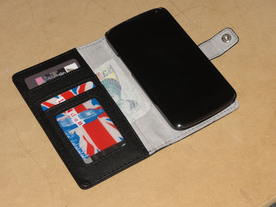
The Leather Style Wallet/Stand Case for the Nexus 4 is quite a unique case. It is, you guessed it, a case, a stand and a wallet. This case covers both the front and back of the phone. It has a leather look to it, and the outer surface is quite hard with little flex to it. It sounds like a good idea. You can have your phone, credit card, driving licence and a bit of spare cash, all in one place. Besides that, with this case, you can watch a video on your phone without having to hold it.
The wallet part of this case has three slots for your standard sized cards. The first slot has a transparent window in it, to keep proof of ID. The second slot can keep a whole card hidden. That might be used for a card you don’t use very frequently but still want access to it. The third slot is slightly shorter than a credit card, and a small bit of the card in that slot sticks out for quick access. Behind the card slots, there is a larger area for a bit of cash, keys, or anything else that will fit in that area.
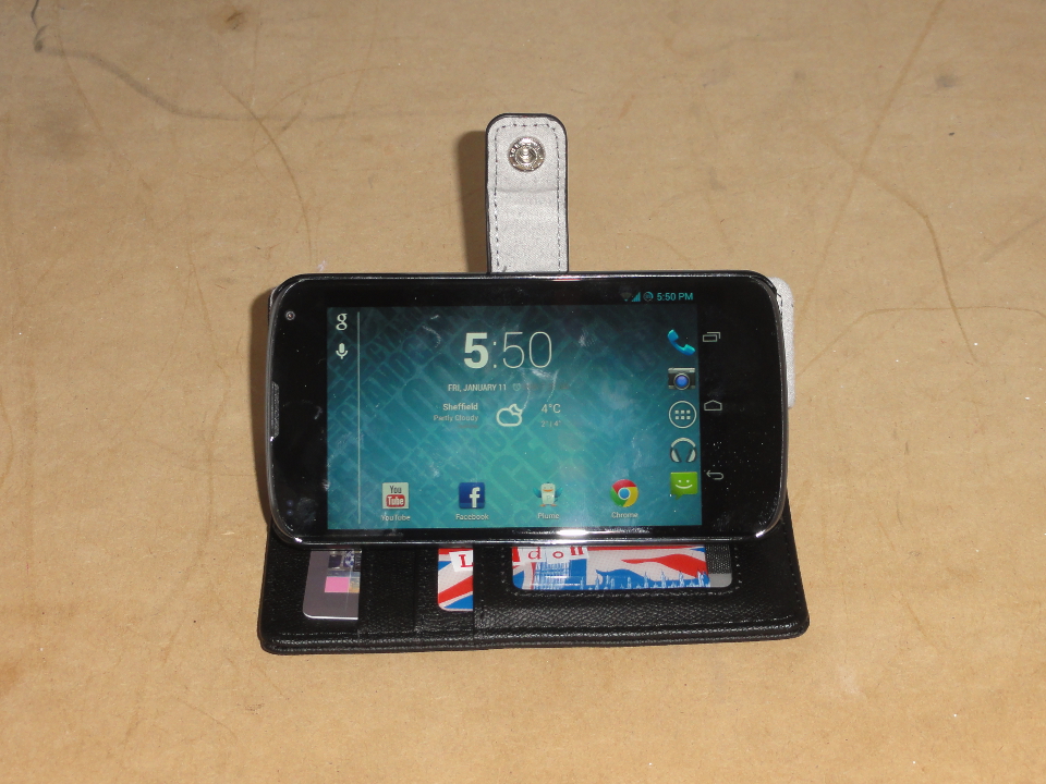
To use the case as a stand, you flip it open and rest the side of the phone on top of the card slots. There is a fold on the back of the case, to allow the phone to tilt for different viewing angles. The angle of the phone can be adjusted from being nearly perpendicular to the desk, to being at an angle of around 30˚. To use the homescreen in landscape mode, a 3rd party launcher, such as Apex Launcher or Nova Launcher, can be installed on the phone. Both those launchers are free and have an option for enabling automatic rotation in the settings.
This case is excellent for using the Nexus 4 in landscape mode on a desk, or on the arm of a sofa. However, using the phone in portrait mode is a bit awkward. The only way to use the phone in portrait mode in one hand is to flip the front cover behind the phone. This adds a lot of thickness to the phone, making it awkward to hold. Although getting used to it is pretty quick, using the phone without a case simply feels better. Besides that, flipping the front cover to the back of the phone blocks the camera.
I would recommend this case for people who mostly use their phone for watching videos. It is also good for people who keep their phone and their keys in the same pocket, as this case will prevent the screen from being scratched. The Leather Style Wallet/Stand Case is available in black or blue, and it can be purchased from MobileFun.co.uk, under Nexus 4 cases.
Posted on Wednesday 9th January 2013 - Leave a comment
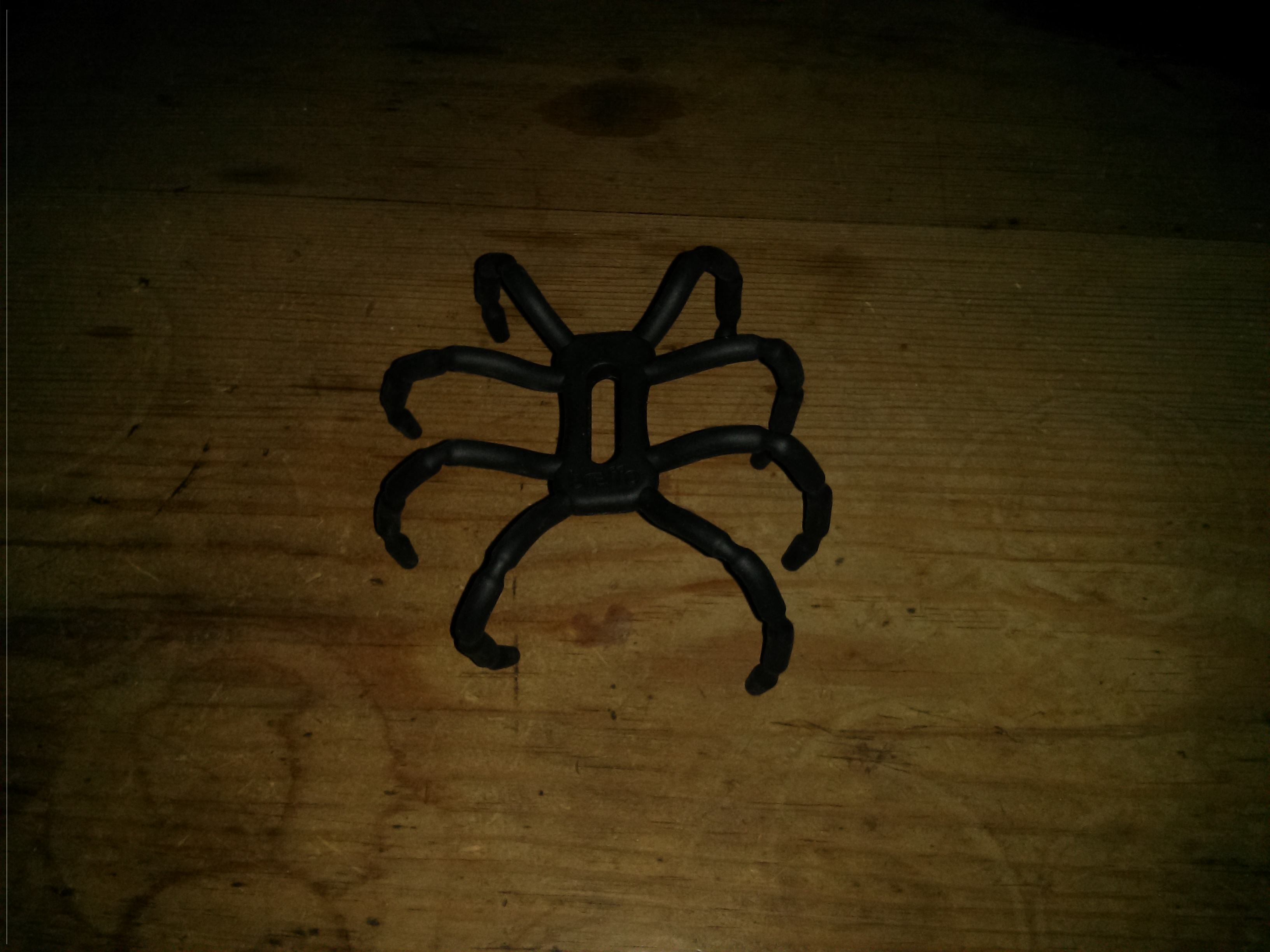
The Spider Podium Universal Desk Stand is a flexible wire frame, coated in rubber, designed to mount a smartphone in a standing position. With its 8 legs, it resembles a spider, hence the name of the product. This desk stand costs £14.95, and I got it from MobileFun.co.uk to review. When I first received it, I was glad that I didn’t pay nearly £15 for it. However, when I played around with it for a bit, I got to like it.
Although this product is sold by Breffo as a desk stand, there are many creative uses for it. With the 8 flexible legs and the way they are placed, it is possible to mount your smartphone on the handlebars of your bicycle for easier use of a GPS application. You can also hang the desk stand on the back of a car seat and watch a movie on your smartphone with ease.
Those examples, as well as a few more, are illustrated on the back of the packaging of the desk stand. However, it can also be used as a tripod for your camera, and as a way to mount a 10 inch tablet in a comfortable typing position. With a bit of creativity, the possibilities are practically endless.
When this desk stand is being used on a desk, it works best with your smartphone mounted fairly close to the desk. That way, it is easier to press the buttons on the side of your phone without knocking it over. However, this desk stand also works well on soft surfaces; possibly better, as there is a much smaller chance of one leg floating above the surface.
Like all products, the Spider Podium Universal Desk Stand is far from perfect. However, its main flaw is a deal breaker for nearly anyone thinking of buying it. On the day I received it in the mail, the wire in one of the legs broke like a paperclip when I was trying out different positions for it. It can still be used with 7 legs, and it will work great with 4 legs. However, with that one leg shaking around, it feels like it was on sale at a 99p shop.
In theory, the Spider Podium Universal Desk Stand is an excellent idea and it could potentially be a great product if it used a different, more flexible material on the inside. However, the product that is currently being sold has plenty of room for improvement.
A Spider Podium Universal Desk Stand, as well as many other smartphone accessories, can be found at MobileFun.co.uk, under iPhone 5 accessories.
Posted on Thursday 27th December 2012 - Leave a comment
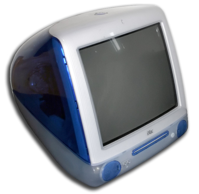 About a year ago, I got hold of an iMac G3 that was found in the street. Unfortunately, it is just the iMac, without the mouse and keyboard. However, I still have a computer from the line of computers that saved Apple in the late 1990’s.
As far as I can tell, the machine I have was originally purchased in 2000. It has an indigo back and a slot loading disc drive. It also has a 350MHz processor, 192MB RAM and a 10GB hard drive. It weighs a little bit less than 16kg, and there is a handle on the top of it, in case you want to take it to Starbucks.
When I got hold of the iMac G3, it was running Mac OS X Panther and still is, as I can’t be bothered to upgrade it. Because of that, there aren’t that many applications that will not run on that computer, and there are no modern Internet browsers available for it. It is not officially able to run Mac OS X Tiger, which makes this machine too old and complicated for regular use.
Although this computer is running very outdated software, it is excellent for the time. My favourite feature in older versions of OS X is the look and feel. There are some things I like about the look of OS X Mountain Lion, but I do miss the aqua blue scrollbars. As for the dock at the bottom of the screen, it is free of lag, even with magnification turned on, and the software works very well with the hardware.
The computer comes with Apple Works, an office suite that came with all Macs at the time before we saw iWork. Apple Works is easy to use. It is fairly simple, but it has all the features most people need in an office suite. The Apple Works suite is packaged into one application, and it is great for those who want Microsoft Office, but don’t want to fork out around £100 for it.
The iMac is able to boot into Mac OS 9.2 which may be a useful feature for some people. However, I didn’t find anything you could do in OS 9 that you can’t do in OS X. OS 9 looks like it was made in the 90’s, and that’s because it was. Apple’s transition to OS X was a smart move, as Macs today are much easier today than they were in the 90’s.
The iMac G3 is a great computer for anyone who isn’t a heavy Internet user. Right now, it is a machine for someone who doesn’t care about having the latest software or the fastest hardware. Although it isn’t good enough for the average user today, it would be fine for people who are new to computers.
Posted on Wednesday 7th November 2012 - 1 comment
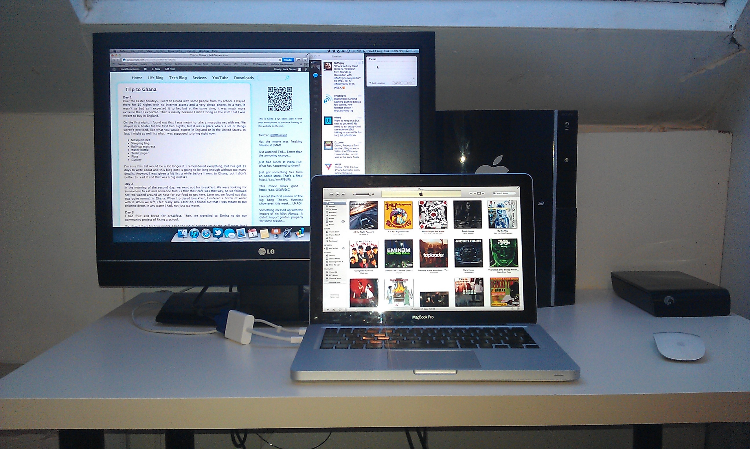
My main computer is a 2009 MacBook Pro, which I received and unboxed on December 23rd 2009. Right now, it might be a little late to do a review on my MacBook, a computer that is now nearly three years old. However, I want to give new Mac users a basic idea of what OS X is like, and how a Mac can last quite a long time for most users.
My MacBook Pro came with a 2.53 GHz Intel Core 2 Duo, 4 GB of RAM which has now been upgraded to 8 GB, and a 250 GB Hard Drive which has been upgraded to a 512 GB SSD. In other words, my Mac was a step up from the base model of the MacBook Pro. I got the step up model because a friend knew someone who worked for Apple and could get a good discount in it.

My MacBook Pro has the same design as the MacBook Pro’s you can buy today. This design is over three years old, yet it still looks good. The outer shell of the MacBook Pro is made from aluminium. That means there is almost no flex, if any. Because of the aluminium unibody, the computer also feels like a high quality machine.
My MacBook Pro originally shipped with OS X Snow Leopard, but it has had two operating system upgrades and is now running OS X Mountain Lion. One of the main reasons I bother upgrading my Mac to the next OS is because it is cheaper. The OS X Lion upgrade was around £20 and the OS X Mountain Lion upgrade was £14. In comparison, most Windows upgrades cost over £100. I hear that upgrading to Windows 8 will be cheaper, but I also hear it will still cost more than OS X upgrades.
OS X is a great desktop operating system. It has great window management, with Mission Control as a way to see all your open windows grouped by applications, all your fullscreen apps and if you want, your dashboard. Another feature I love in OS X is the App Store, which like the iPhone, allows you to use iTunes credit to purchase software instead of sharing your credit or debit card details.
Besides great features, OS X is also a lot more stable than Microsoft Windows. Saying that, most operating systems I have tried are more stable than Windows, including Ubuntu. However, most people don’t know about Ubuntu and while I think Ubuntu 12.04 is mostly ready for the average user, it doesn’t have Mission Control and the developers of Ubuntu only control the software, which means that some of the drivers for internal hardware might not work correctly.
OS X is a great operating system and if you want to find out more about it, you will have to go into an Apple store or check the Apple website. However, like all operating systems, there are some things I don’t like about OS X. Firstly, it has more applications you have to pay for than other operating systems. This is not Apple’s fault, but at the same time, Apple could provide the iWork applications out of the box, as the days of paying for office software have mostly ended due to Google Drive.
Another problem I have with OS X is how Apple add their software to their iOS devices, but completely ignore Android. Android is an iOS competitor, but Windows is also a competitor with OS X, yet Apple still make iTunes for Windows. I would like to see iTunes for Android which would allow me to purchase iTunes music and sync my phone with iTunes, and an iCloud app which would allow me to use more of iCloud than just the email part of it.
While OS X has it’s problems, it has had Boot Camp since Apple switched to Intel processors in their Macs. That means if I wanted to go back to Windows for a bit, and I didn’t mind buying it, I could have a dual boot setup. However, I think the problems with OS X are less of a pain to deal with than the problems with Microsoft Windows.
Posted on Tuesday 7th August 2012 - Leave a comment

I recently upgraded my MacBook Pro to OS X Mountain Lion and I am going to go through the upgrade procedure and some of the new features, including some small changes that I actually like.
Before I start on OS X Mountain Lion, I want to make it clear that Apple released Safari 6 to OS X Lion. Certain features have been left out, but if you are planning to upgrade to Mountain Lion just to get full width tabs in Safari, and to be able to Google stuff from the URL bar, check Apple Software Update first.
Upgrading my Mac to OS X Mountain Lion went fairly smoothly. I was not able to download the upgrade straight away because Apple’s servers were too busy earlier on. This is not surprising as many Mac users have been wanting to get their hands on Mountain Lion for months.
The download of OS X Mountain Lion was quite large. It is approximately a 4GB download, which is almost double the size of an ISO image of the Windows 8 Release Preview. The download size of an Ubuntu ISO image is approximately 700MB, less than 1/5 of the OS X download. Large file sizes aside, I did not have much trouble upgrading my Mac to OS X Mountain Lion.
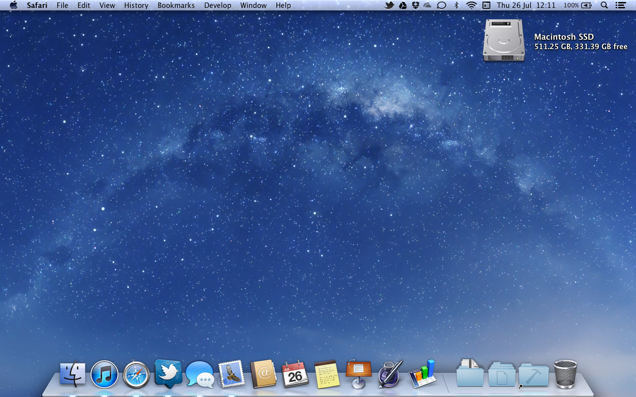
The image above is a screenshot of my desktop. As you can see, I have changed the wallpaper from the default wallpaper to a picture of the Milky Way Galaxy. I don’t remember seeing this wallpaper in OS X Lion, and there are a lot of other wallpapers that were just added in OS X Mountain Lion.
Apple made some very small changes to OS X. One change I like is the dock, with a new background. It is more minimal, but it still has the cool 3D look and the slight reflection of the desktop. Another small change in Mountain Lion is with the scroll bars. When you hover over them, they get wider, making it more obvious that you can scroll the old fashioned way if you wish. There are other small changes, including rubber band scrolling in grid stacks on the dock.
Apple have also renamed a couple of the applications in OS X. Address Book is now called Contacts and iCal is now called Calendar. Those changes are very small and I’m sure they could be made in any version of OS X in a user account with administrator privileges. However, it makes me wonder when System Preferences will become Settings and when iTunes is split into Music, Videos and Books.
As for bigger changes, Apple have added social network integration to several applications in OS X, with the ability to share website links on Twitter for now. Apple say Facebook will be added in a future software update. However, I do not see why it couldn’t be included now, as a lot of my friends don’t use Twitter. I would also like Google+ integration to be added in the future.
OS X Mountain Lion comes with a few improvements to iCloud, which is one of the main reasons I upgraded. In iWork, I am now able to save presentations, documents and spreadsheets to iCloud. This means that when I go to school, I can take a lot of my notes on my iPad. I will probably be able to leave my MacBook at home more, and I will be able to annoy everyone else in class with the clicky sound you get in the iOS keyboard.
Apple added a few iOS applications to OS X. OS X now has Reminders, Notes and Game Center. I do not know if I will be using Reminders and Notes on my Mac, but they are now there if I do decide to use them. As for Game Center, I am not much of a gamer and I never used Game Center on my iPod Touch or my iPad. However, there are people who use Game Center on their iOS devices and they will start using it on their Macs.
With the release of OS X Mountain Lion, Apple also released Safari 6. It has a few features that you can only get on OS X Mountain Lion, such as share sheets, iCloud tabs and a pinch gesture that allows you to preview all your open tabs. Pretty much everyone I know has switched to Google Chrome, but Apple are still trying to compete in their own way. Safari doesn’t have a screen for web apps like what is found in Google Chrome, but perhaps Apple will give OS 10.9 iOS-like web-app support, allowing users to add websites to the dock and launchpad as applications.
One of the biggest new features in OS X Mountain Lion is Notification Center. I am able to see notifications for supported apps with a quick swipe on the trackpad. As of writing this post, the applications on my Mac that support notification center include Calendar, FaceTime, Game Center, Google Chrome, MagicPrefs, Mail, Messages, Reminders, Safari and Twitter. I have figured out how to show the birthdays of my Facebook friends in the notification center by syncing calendars between Facebook and my Gmail account.
The upgrade to OS X Mountain Lion costs around $20 in the USA and around £14 in the UK. Apple will let you upgrade from the latest version of OS X Snow Leopard, 10.6.8, or from any version of OS X Lion. More information about upgrading can be found here, including whether or not your Mac can be upgraded. You can install the upgrade with an Internet connection and the first season of South Park. The download from the App Store will take a while, so make sure you have a good DVD or something to kill a bit of time.
Posted on Thursday 26th July 2012 - Leave a comment
Next Page »
 The Cover-Mate Desktop Charging Dock is made for LG and Samsung Smartphones. It should work with any phone with the Micro USB port on the bottom, and the wide end of the Micro USB plug facing the back of the phone.


 I chose the Nexus 4 over another smartphone for quite a few reasons. I chose it over an iPhone 5 because of how open it is to developers, and I chose it over an HTC One S for the attention it will get from the developer community. The on screen buttons are also pretty cool.


 About a year ago, I got hold of an iMac G3 that was found in the street. Unfortunately, it is just the iMac, without the mouse and keyboard. However, I still have a computer from the line of computers that saved Apple in the late 1990’s.