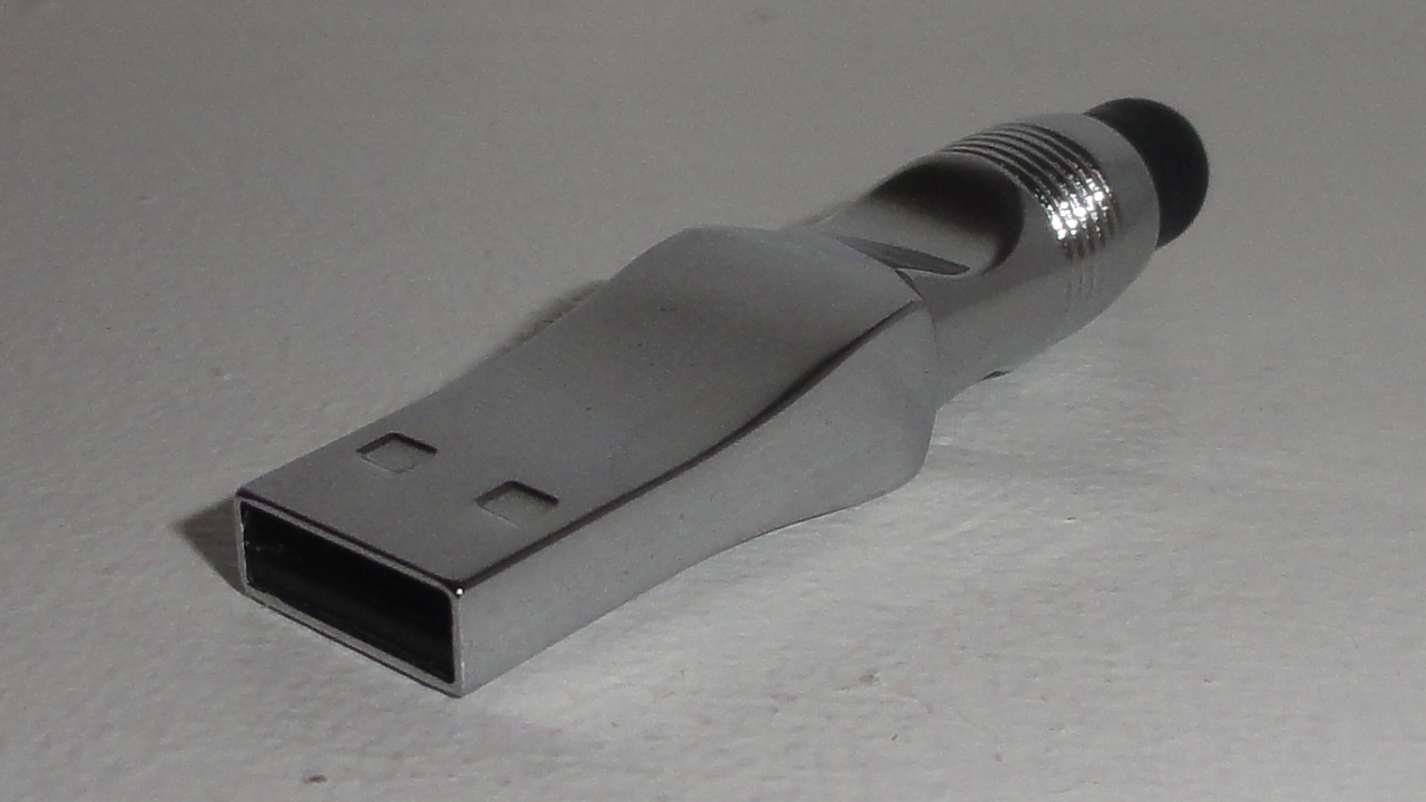
The idea of using a stylus with a smartphone seems a little bit old fashioned today. Steve Jobs never liked them, and they were originally meant to make it easier to use old resistive touchscreens. As smartphones evolved to catch up with Apple’s iPhone, the stylus mostly died out. However, Samsung started their Galaxy Note series, with the S-Pen advertised as the main selling point. The Galaxy Note II is currently one of the most popular smartphones among the Android crowd, and it easily matches Google’s Nexus 4 with popularity. Clearly, the stylus hasn’t completely died out, and there are still several uses for one.
Using a good quality stylus is one of the best ways to prevent fingerprints on the screen of your smartphone. A stylus can also be used to draw quick pictures on your smartphone or tablet, to save paper. One of the best uses for a stylus is for when you are wearing gloves. Finally, a stylus might be used by someone who wants to use a smartphone, but isn’t used to touchscreens. Although most mobile software today uses buttons big enough for users to tap with their thumb, some people still find a stylus to be a more accurate pointing device.
The first problem I found with this stylus is its length. The stylus is too short to be used like a pen or a pencil, and it is awkwardly shaped, meaning there is only one way to hold it comfortably. It is possible to get used to the length of this stylus, and it is meant to be small. However, if this stylus was around half the length of a pen, it would still fit into nearly any pocket, and it would be a lot more comfortable to use.
Another problem with this stylus is that it leaves prints on a smartphone screen. If you are looking for a stylus specifically to avoid fingerprints, you will find stylus prints instead, and they are just as bad. This isn’t a big problem, as the marks can simply be wiped off. However, it is something to keep in mind.
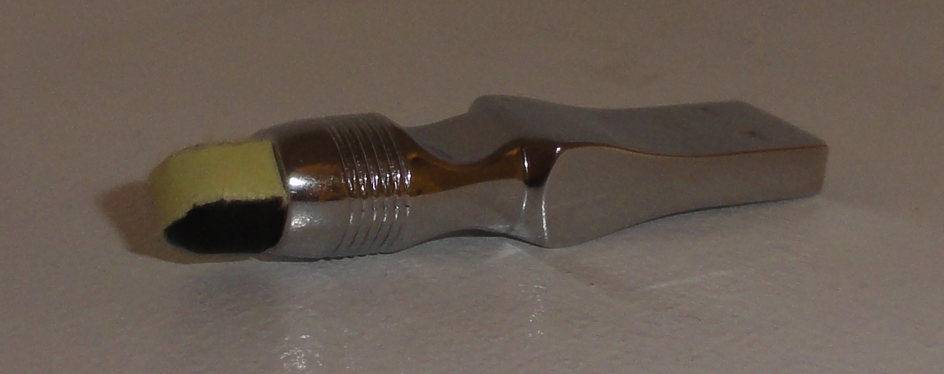
The biggest problem with this stylus is how it is made. The part used to touch the screen is covered in a thin layer of smooth plastic, to make it easier to use the stylus for swipe gestures. That layer of plastic started to peel off in about a day of regular use and some time in my pocket. Because of that, with too much swiping, the rubber tip at the end falls off. This problem can be solved by covering the end of the stylus with a thin strip of paper or sticky tape, but that way of fixing the problem makes the stylus look a bit cheap.
The other end of this stylus has a built in USB flash drive. This flash drive has 16GB to store your data, and it operates at a reasonably fast speed, only taking a few minutes to transfer around 1GB of data. It has always been impossible to have too many USB flash drives, and that is especially true today. Because of that, the USB flash drive adds a lot of value to this stylus.
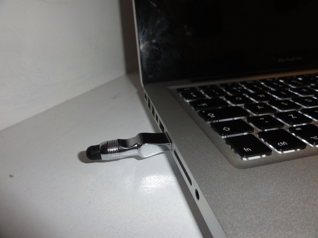
I would recommend this stylus for someone who just wants an accurate pointing device for their smartphone, or for someone who wears gloves a lot. I would not recommend this stylus for someone who won’t use the USB flash drive. Overall, this stylus is a good idea, and with the £15 price tag, it has good value for money. However, it could certainly be improved. This stylus can be bought from MobileFun.co.uk, under Galaxy Note 2 accessories.
Posted on Tuesday 12th February 2013 - 3 comments
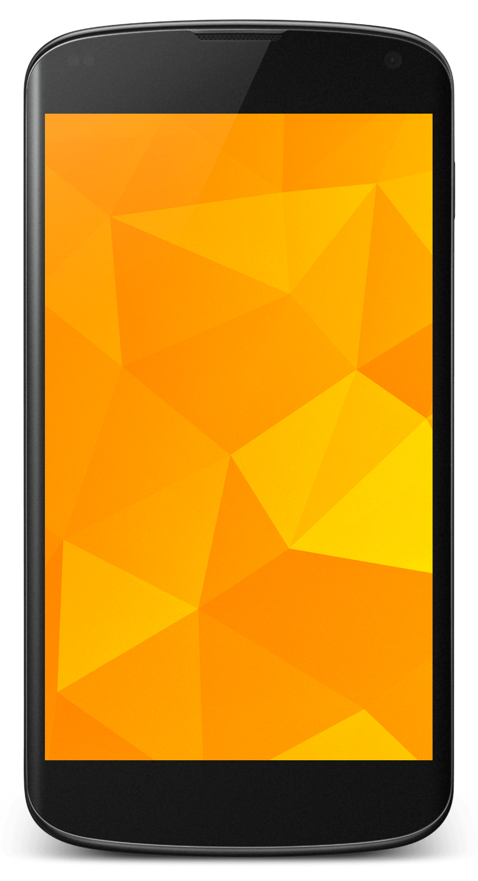 I chose the Nexus 4 over another smartphone for quite a few reasons. I chose it over an iPhone 5 because of how open it is to developers, and I chose it over an HTC One S for the attention it will get from the developer community. The on screen buttons are also pretty cool.
Unlocking the bootloader is really easy with a Nexus device. With the Android SDK installed on your computer, the bootloader of this phone can be unlocked with a simple Fastboot command:
fastboot oem unlock
And unlike many other Android devices, when a Nexus device is unlocked, all partitions are fully unlocked, meaning there is no need to use Fastboot to flash boot images to the phone with new ROMs.
The Nexus 4 is a developer’s phone. This means that, with the exception of Google Apps, all the software preinstalled on this phone is open source. Because of that, this phone will get plenty of attention from the developer community for years, and custom ROMs like CyanogenMod will become stable daily drivers almost immediately.
CyanogenMod was the first of the most well known custom ROMs to come to the Nexus 4, which means it has had the most time to mature and become stable. It gives you root access, as well as allowing you to make customisations to stock Android. It also comes with little goodies, such as Trebuchet Launcher and the Chronus clock widget.
AOKP development started after Google released Android 4.0 and the Galaxy Nexus in 2011. Like CyanogenMod, AOKP allows you to make changes to stock Android. It has more customisation features than CyanogenMod, which is why many people really like it. However, it doesn’t come with Trebuchet Launcher or the Chronus clock widget.
ParanoidAndroid is great for those who want something different on their phone. Basically, ParanoidAndroid allows you to use your phone like a tablet by moving the notifications to the bottom of the screen and scaling the graphics down. It allows you to specify which apps you want to run in tablet mode and which apps you want to use normally. Anyone with an unlocked Nexus 4 should give it a try, although I wouldn’t recommend it for someone with fat fingers.
In coming months, you can expect many other ROMs to come to the Nexus 4. I am currently waiting to see a version of MIUI for the Nexus 4, as I really like the look and feel. I also hope to see PAC-Man ROM, which basically combines the best features of the ROMs I mentioned above.
Posted on Wednesday 30th January 2013 - Leave a comment
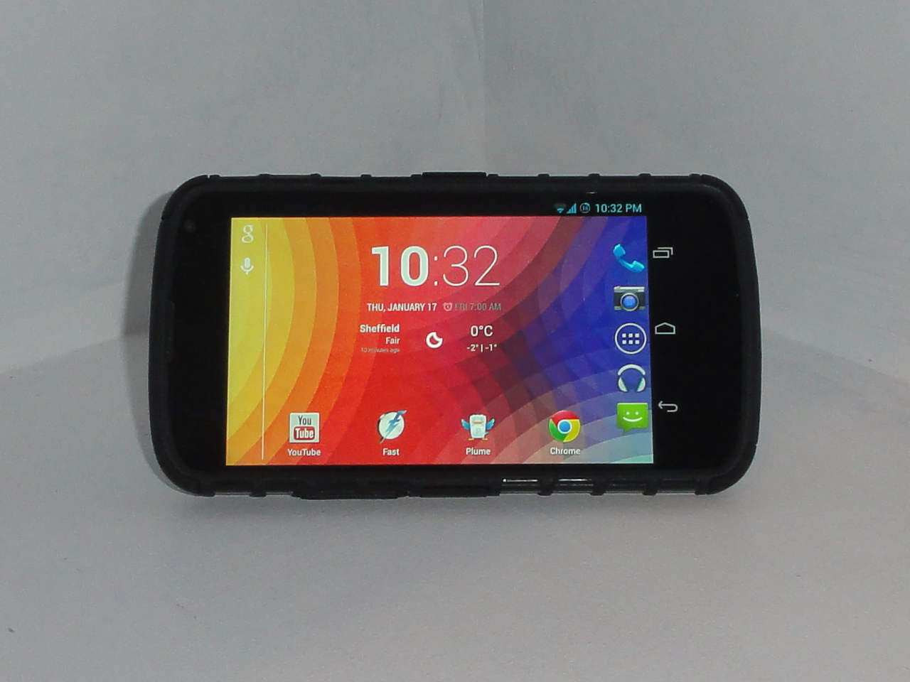
The ArmourDillo Hybrid Protective Case for the Nexus 4 is, as the name suggests, a rugged case that is made to protect the Nexus 4 from drops and bumps. This case comes in two parts; a flexible part that wraps around the back and edges of the phone, and a hard outer shell that covers the back and clings around the corners and two sides of your device. This case comes in red, blue and black.
The back of this case is not made for looks. However, although it doesn’t look as good as the glass back of the Nexus 4, it isn’t ugly either. The design of the back is made to provide good grip when holding the phone, and to ruggedise it. With this case, it doesn’t feel like I’m going to drop my phone, and I was also impressed to find that the case has a pleasant soft touch to it.
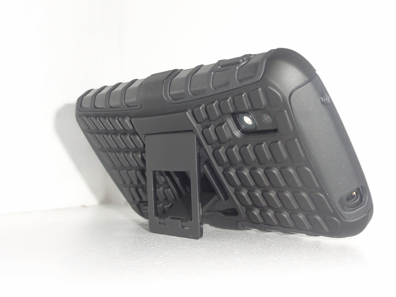
On the back of the case, there is a kickstand. The kickstand has to be opened with a finger nail. It also feels a bit cheap, and I think it could be broken off quite easily with a bit of abuse. However, it is a nice addition to the case, and if it is closed properly when it isn’t being used, it should last well.
One thing I didn’t like about the case is how the side buttons are covered. This is to provide maximum protection, and to keep the phone in good condition. However, the power button has to be pressed harder to wake the phone up and, although this isn’t a big problem, it takes some getting used to.
Another thing I didn’t like about this case is how the edges of it, at the front of the phone, go above the touchscreen. This makes it harder to swipe onto the screen from the left or right edge, a commonly used gesture in mobile apps. Of course, this is required to some extent with any case in order to protect the screen from drops. However, the edge only needs to be raised a little bit to protect the screen from drops on flat surfaces.
One thing to think about with any case is the amount of thickness it adds to the phone. This case nearly doubles the phone’s thickness. However, while this may be a problem to some people, it isn’t a problem to me. The Nexus 4 is quite a thin phone, and with the case on, it doesn’t feel that much thicker in the hand.
Overall, the ArourDillo Hybrid Protective Case is one of the better cases in its price range. I would recommend this case for anyone. Particularly, someone who wants to protect their phone, and who doesn’t mind imperfections like the added thickness. I would also recommend this case for someone who watches a lot of videos on their phone, because of the kickstand. This case can be bought from MobileFun.co.uk, under Nexus 4 accessories.
Posted on Friday 18th January 2013 - 3 comments
 I chose to buy a Nexus 4 over another phone for quite a few reasons. I chose it over the iPhone 5 because I like having home screen widgets and moving wallpapers. I chose it over any other Android phone because I wanted quicker Android updates than what I could get on my HTC Desire S.
The Nexus 4 feels great to hold. It has glass on the front and the back, and soft touch rubber around the edges of the phone. The screen looks great, and the pixels are almost not there. The back of the phone has a really nice looking sparkle effect to it.
This phone has excellent software. I have full control over what is on my home screen, and I can even install a new home screen. I can launch Google Now from anywhere by swiping up from he home button, and I can even access some of my apps from the lock screen.
There are too many features in the software on this phone for me to pick a favourite, or even a set of favourites. I really like the convenience of having quick settings in the notification panel. I also love the PhotoSphere feature in the camera app.
Although I love this phone, it has its share of problems in both hardware and software. The biggest hardware problem with this phone is the glass back. It looks and feels great, but everyone drops their phone. With the Nexus 4, there is double the chance of having a crack on your phone whenever you drop it.
The built in speaker on this phone doesn’t sound terrible. However, it is certainly nothing special. It is not the loudest speaker on a phone, and because of its size, sound coming from it can be muffled very easily.
Although the Quick Settings panel in Android is really convenient, there is no way to change the toggles in that panel. This could be a real problem for someone who uses the portable hotspot feature on their phone a lot, or even an annoyance for someone who has automatic brightness enabled.
This phone costs £239 with 8GB of internal storage and £279 with 16GB. I would recommend paying extra for the 16GB model, as this phone doesn’t have a microSD card slot. Overall, the Nexus 4 is an excellent phone. It is one of the best phones of 2012, and with the hardware of this phone, the price point only makes it a more attractive choice.
While the Nexus 4 is an excellent phone for the average user, it is even better for hackers and developers. It is really easy to unlock this phone’s bootloader, and since it is a flagship phone from Google, it will get loads of attention from the developer community. For those who understand what that means, I am working on a Hacker Edition of this review.
Posted on Tuesday 15th January 2013 - Leave a comment
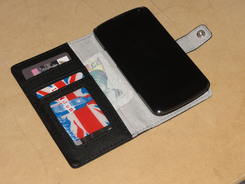
The Leather Style Wallet/Stand Case for the Nexus 4 is quite a unique case. It is, you guessed it, a case, a stand and a wallet. This case covers both the front and back of the phone. It has a leather look to it, and the outer surface is quite hard with little flex to it. It sounds like a good idea. You can have your phone, credit card, driving licence and a bit of spare cash, all in one place. Besides that, with this case, you can watch a video on your phone without having to hold it.
The wallet part of this case has three slots for your standard sized cards. The first slot has a transparent window in it, to keep proof of ID. The second slot can keep a whole card hidden. That might be used for a card you don’t use very frequently but still want access to it. The third slot is slightly shorter than a credit card, and a small bit of the card in that slot sticks out for quick access. Behind the card slots, there is a larger area for a bit of cash, keys, or anything else that will fit in that area.
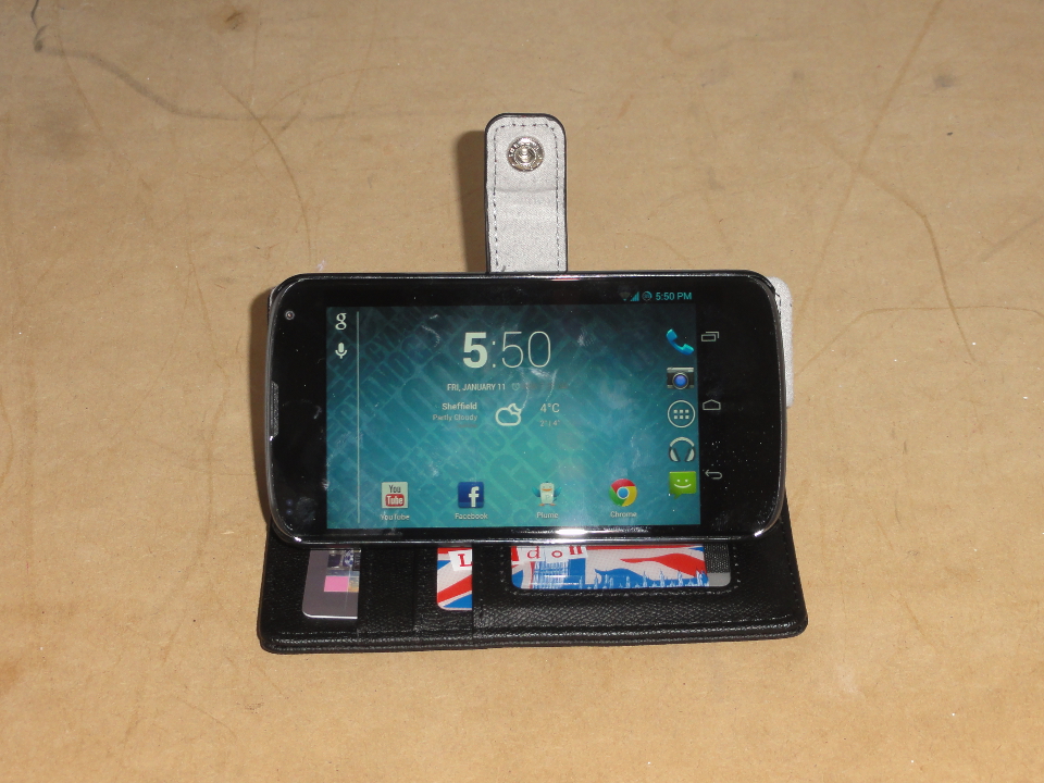
To use the case as a stand, you flip it open and rest the side of the phone on top of the card slots. There is a fold on the back of the case, to allow the phone to tilt for different viewing angles. The angle of the phone can be adjusted from being nearly perpendicular to the desk, to being at an angle of around 30˚. To use the homescreen in landscape mode, a 3rd party launcher, such as Apex Launcher or Nova Launcher, can be installed on the phone. Both those launchers are free and have an option for enabling automatic rotation in the settings.
This case is excellent for using the Nexus 4 in landscape mode on a desk, or on the arm of a sofa. However, using the phone in portrait mode is a bit awkward. The only way to use the phone in portrait mode in one hand is to flip the front cover behind the phone. This adds a lot of thickness to the phone, making it awkward to hold. Although getting used to it is pretty quick, using the phone without a case simply feels better. Besides that, flipping the front cover to the back of the phone blocks the camera.
I would recommend this case for people who mostly use their phone for watching videos. It is also good for people who keep their phone and their keys in the same pocket, as this case will prevent the screen from being scratched. The Leather Style Wallet/Stand Case is available in black or blue, and it can be purchased from MobileFun.co.uk, under Nexus 4 cases.
Posted on Wednesday 9th January 2013 - Leave a comment
Before the late 2012 Nexus devices were announced, I wrote my wish list for Android 4.2. Since then, Google released Google Play Music to the UK Play Store. They also released the Nexus 4 and Android 4.2 and, although the update didn’t include much on my wish list, it included some features I never thought of, which made it a great update.
I think it is time for me to make my predictions of what we will see in the next version of Android. I will try to keep this short, but there are no promises. First of all, let’s start off with the most obvious prediction. Android 5.0 will be named Key Lime Pie. This is the first desert, if not the only desert, that many people can think of that begins with K.
New Look
Android looks fine as it is. It is clean and looks futuristic. However, it still doesn’t look perfect. The Messaging widget looks like it was designed for Android 3.0 Honeycomb. Besides that, there are certain aspects of the user interface that make the phone look more like a robot. I know that’s what they call it; “Android”, but in my opinion, HTC Sense and MIUI just look more user friendly.
I’m expecting Android to get a look similar to Google’s iOS apps. They have the user-friendly look that you see on the iPhone, combined with Google’s style of clean minimalism. However, I would also like to see more colours for Android apps. That way, apps like Twitter could start following the Holo design guidelines while keeping their signature colours.
With the new look, I would also like apps to control the background colour of the notification bar and, for Nexus devices, the button bar. At the moment, an app might hide those bars to play a video in full screen. However, there’s not much else. I would also like those bars to be transparent when I’m on the homescreen, like what you get with Motorola’s newer devices, so I can see the whole wallpaper.
Changes to Core Apps
The default launcher in Android is somewhat limited when it comes to customisation. It allows you to add widgets and move icons around, but there are no homescreen transitions or touch gestures. I like CyanogenMod for having Trebuchet Launcher, which can be customised in the Launcher section of the Settings app. Trebuchet is still quite limited, but great features are being added to it.
The Google Maps app on Android should get some updates. After Google released their Maps application for iOS, even they admitted that it was better than the Android app. Google seem to be showing more love to iOS overall, and although I think they should carry on developing iOS software, it makes more sense for them to focus on their own mobile platform than on their competition.
Google Play Music has plenty of room for improvement. There is nothing wrong with the user interface of the app, but it certainly isn’t anything special. Besides that, the ugly blue background with the weird looking texture to it has to go. With CyanogenMod, there is a music app called Apollo with a simple white background. I would prefer a black background, but Apollo looks way better than Google’s music app.
Google Chrome also has room for improvement. It has a beautiful user interface and some great features, but the actual browser has bugs that I haven’t seen in any other browser. I notice a lot of these bugs on my own blog, mostly with how images are displayed. From what I can tell, this is a problem with how I code images in my blog posts. However, I never see these problems in other mobile browsers.
Better Updates
One of the biggest problems with Android is fragmented updates. When Google releases a new version of Android, nearly all Android users have to wait at least three months to get the update. This is because phone manufacturers put their own overlays on top of Android, and they have to update their overlays to be fully compatible with newer Android releases.
In most cases, carriers also test updates before pushing them out to their customers. Because of the money the carriers make when the users buy new phones from them, they are in no real hurry to release software updates to their customers, as new phones will already have the updated software. Even Galaxy Nexus LTE users in America have been forced to wait for the Android 4.1 Jelly Bean update.
To fix this problem, Google could add a new space at the system level of the phone for manufacturer overlays. That way, Google could push software updates to Android phones directly. Phone manufacturers could update their Android overlays on their own time, and users could even disable the overlays if they don’t like them.
I know there are things that I missed in this blog post, and Google will probably end up making completely different changes to Android in their next release. Please let me know what you would like to see in future Android releases by commenting below.
Posted on Sunday 6th January 2013 - Leave a comment
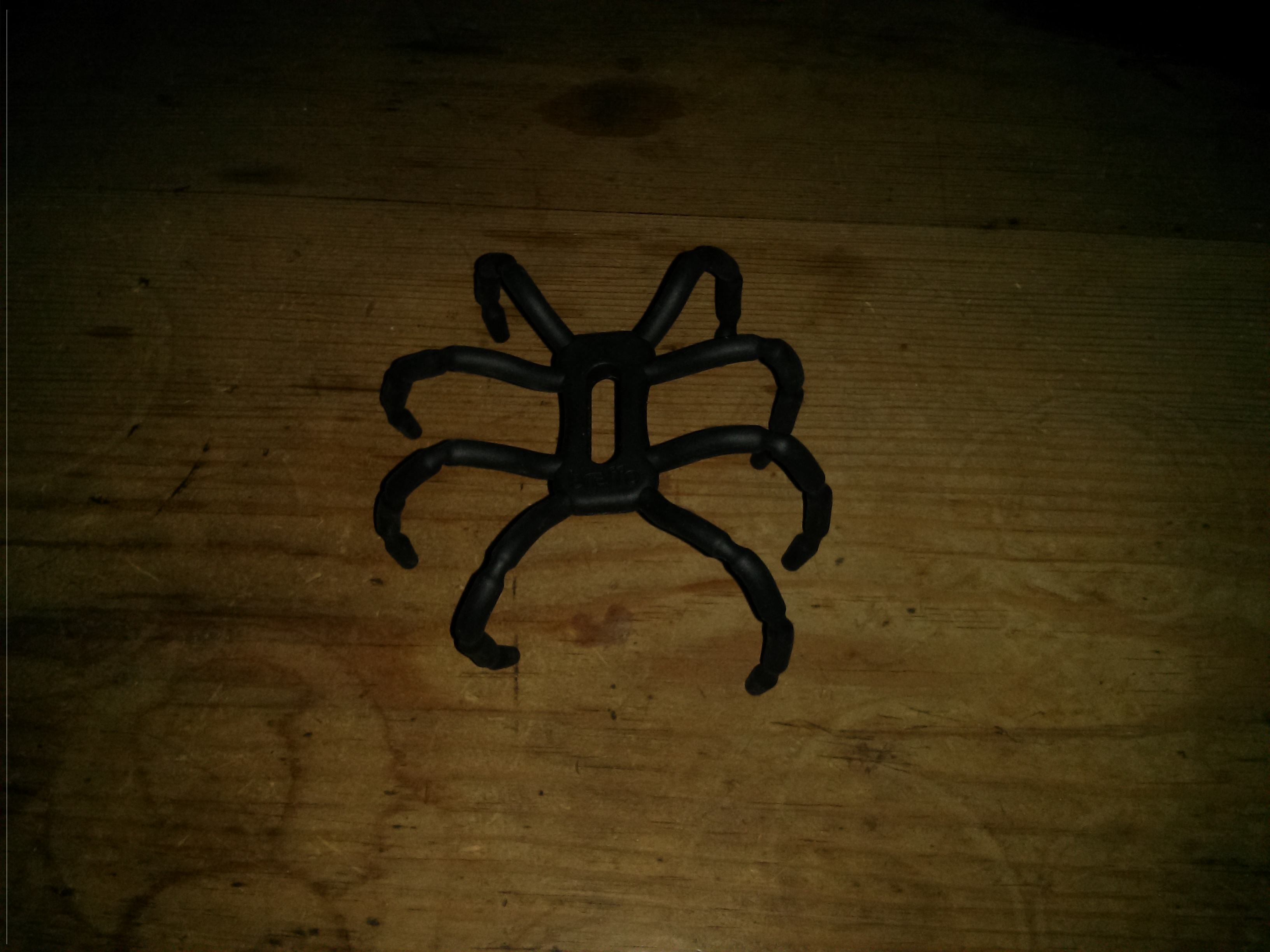
The Spider Podium Universal Desk Stand is a flexible wire frame, coated in rubber, designed to mount a smartphone in a standing position. With its 8 legs, it resembles a spider, hence the name of the product. This desk stand costs £14.95, and I got it from MobileFun.co.uk to review. When I first received it, I was glad that I didn’t pay nearly £15 for it. However, when I played around with it for a bit, I got to like it.
Although this product is sold by Breffo as a desk stand, there are many creative uses for it. With the 8 flexible legs and the way they are placed, it is possible to mount your smartphone on the handlebars of your bicycle for easier use of a GPS application. You can also hang the desk stand on the back of a car seat and watch a movie on your smartphone with ease.
Those examples, as well as a few more, are illustrated on the back of the packaging of the desk stand. However, it can also be used as a tripod for your camera, and as a way to mount a 10 inch tablet in a comfortable typing position. With a bit of creativity, the possibilities are practically endless.
When this desk stand is being used on a desk, it works best with your smartphone mounted fairly close to the desk. That way, it is easier to press the buttons on the side of your phone without knocking it over. However, this desk stand also works well on soft surfaces; possibly better, as there is a much smaller chance of one leg floating above the surface.
Like all products, the Spider Podium Universal Desk Stand is far from perfect. However, its main flaw is a deal breaker for nearly anyone thinking of buying it. On the day I received it in the mail, the wire in one of the legs broke like a paperclip when I was trying out different positions for it. It can still be used with 7 legs, and it will work great with 4 legs. However, with that one leg shaking around, it feels like it was on sale at a 99p shop.
In theory, the Spider Podium Universal Desk Stand is an excellent idea and it could potentially be a great product if it used a different, more flexible material on the inside. However, the product that is currently being sold has plenty of room for improvement.
A Spider Podium Universal Desk Stand, as well as many other smartphone accessories, can be found at MobileFun.co.uk, under iPhone 5 accessories.
Posted on Thursday 27th December 2012 - Leave a comment
Back in February, I wrote a blog post about which smartphone you should get, with the thought of helping the average user make a decision on what they should buy. However, since then, there have been many new devices and announcements. I think this is something I should write about every few months. Besides, let’s face it; I didn’t have my writing style put together back then.
Since the last post I wrote, HTC announced the One series with Sense 4. 6 months later, they announced their revision of the One X with Sense 4+, as well as the J Butterfly and Droid DNA, with 5-inch 1080p displays. Samsung announced the Galaxy S III and the Galaxy Note II. And perhaps most importantly, Apple announced the iPhone 5 and Google announced the Nexus 4 by LG.
 First, let’s look at the iPhone 5. This is one of the biggest changes Apple has made to the iPhone. The first thing you will notice is the larger display, compared to all previous iPhone generations. This phone is incredibly light and feels great in the hand. The power button is a bit hard to reach, as it is on the top of the phone. However, this is the only real design flaw.
Besides the redesign, Apple made many changes to the internal hardware. They gave it the custom built Apple A6 dual-core processor and 1GB of RAM to make it nice and snappy. This hardware may not sound like much when compared to high end Android phones, but Apple spend a lot of time optimising iOS for the hardware it is running on and, in many cases, iOS is faster and smoother than Android.
Although the iPhone is a great device, it easily has its share of flaws as well. Most of the flaws are in the software. Everyone is familiar with iOS and knows how to use it. However, the user interface hasn’t evolved much since the original release, 5 years ago, and it is starting to get boring. iOS has the same unlock slider it has always had, and the homescreen is still just a grid of icons.
Average users generally won’t have a problem with the fact that the iOS user interface hasn’t ever really changed. While some people consider the user interface in iOS to be boring, a lot of people think of it as familiar. The average user doesn’t want to learn a new user interface every time they get a new phone, and this is harder for them than it is for geeks like me.
There are problems with iOS that will be noticed by the average user. Apple’s Maps application, introduced in iOS 6, was a big fail. Although it will get fixed eventually, users currently have to rely on third party alternatives. Besides that, when Apple add a new system app to iOS, it is on your home screen forever. It can usually be hidden away in a folder, but there is no way to remove it.
Overall, the iPhone is the best phone for the average user. Despite the flaws, iOS provides users with a great experience. The App Store has all the apps that everybody has heard of, and new iPhone users get access to iCloud and the iTunes Store. However, an iPhone costs quite a lot, with the iPhone 5 priced at £529, or $649. With that price tag, someone on a budget might consider buying a cheap Android phone, such as the LG Optimus L3.
 The LG Optimus L3 is by no means a power house. It has a single-core 800 MHz processor and 384 MB of RAM. Not to mention, this phone has a QVGA 320×240 screen. However, it should be just fine for a first time smartphone user. You could probably get hold of this phone for under £50, if you know where to look.
This phone will never see an official update to any version of Android past 2.3, and any unofficial ports on this phone will likely be slow with little hardware support. However, it is still running a version of Android that will let you install many of the apps currently on the Google Play Store.
Android is a great mobile platform, and it is not made for entry level devices like the Optimus L3. This phone doesn’t have a front facing camera for video calls, and the camera on the back is by no means anything special. If you try this phone out and like the software, but want a bit of a hardware upgrade, you may want to consider buying a Nexus 4.
 The Nexus 4 is built by LG and sold by Google. This phone is a real power house, with a quad-core Snapdragon S4 Pro CPU clocked at 1.5 GHz. This phone is a great option for people who want the latest and greatest software on their phone as soon as possible. This phone is also priced very reasonably, at £239 for the 8GB model and £279 for the 16GB model.
This phone is running Android 4.2 Jelly Bean without any customisations from the manufacturer or bloatware from your network. Because of that, this phone will get immediate updates to future versions of Android, straight from Google.
This phone has excellent external hardware. It has high quality Corning® Gorilla® Glass 2.0 on both sides, and great feeling soft touch rubber around the edge. The back of the phone has a design that reflects light when you look at it from different angles, to keep things interesting.
Besides what the average user will notice, this phone is excellent for hackers and developers. It has an easily unlockable bootloader for installing custom Andriod builds. However, the number one reason for getting a Google phone is the attention it will get from developers. Even after Google stop supporting this phone, it will continue to be updated by the developer community until the hardware simply can’t work with the software, and with a quad-core processor, that might take a while.
 If you don’t care about the latest version of Android, and you just want high quality hardware that will last a while, you may want to consider an HTC One S. It has an aluminium unibody design and an excellent camera that can shoot video and take pictures at the same time.
The One S comes with Android 4.0 with HTC Sense 4 out of the box. HTC are currently rolling out the Android 4.1 update which comes with HTC Sense 4+. HTC Sense provides the user with a nice looking user interface and loads of excellent widgets to make your home screen more functional.
Like all phones, the One S isn’t without its flaws. The animations in HTC Sense make every day tasks slower. The default internet browser in particular has plenty of room for improvement, as it is lacking in features. Besides the software problems, this phone is overpriced, costing around £300 on Amazon.
This phone is overall not the best for average users. However, it is a terrible device for developers. HTC allow users to unlock the bootloader on the One S, but they have a funny way of doing it that makes it hard for users to flash a custom recovery or most custom ROMs without the use of a computer. Anyone thinking of buying an HTC One S should consider the Nexus 4.
 If you don’t care about look and feel, and you just want a phone with as much functionality as possible out the box, you may want to consider the Samsung Galaxy Note II. This phone has a massive 5-inch 720p display and software to take advantage of the screen size.
Like the Nexus 4, this phone has a powerful quad-core processor and 2GB RAM. However, unlike the Nexus 4, this phone has the software to take advantage of the hardware. This phone will allow you to achieve true multitasking by running multiple apps on the screen at once.
This phone also has an internet browser which can run in its own window, above what you are currently doing. And finally, this phone has a stylus called the S-Pen which can be used for drawing things with ease. It even allows you to take screenshots and write on top of them.
Although the Galaxy Note II is a great device, it also has some flaws. Some people like the look and feel of the software running on it, but I always thought TouchWiz looked a bit ugly. This phone is also a bit too big for one handed use. Besides that, this phone costs over £400.
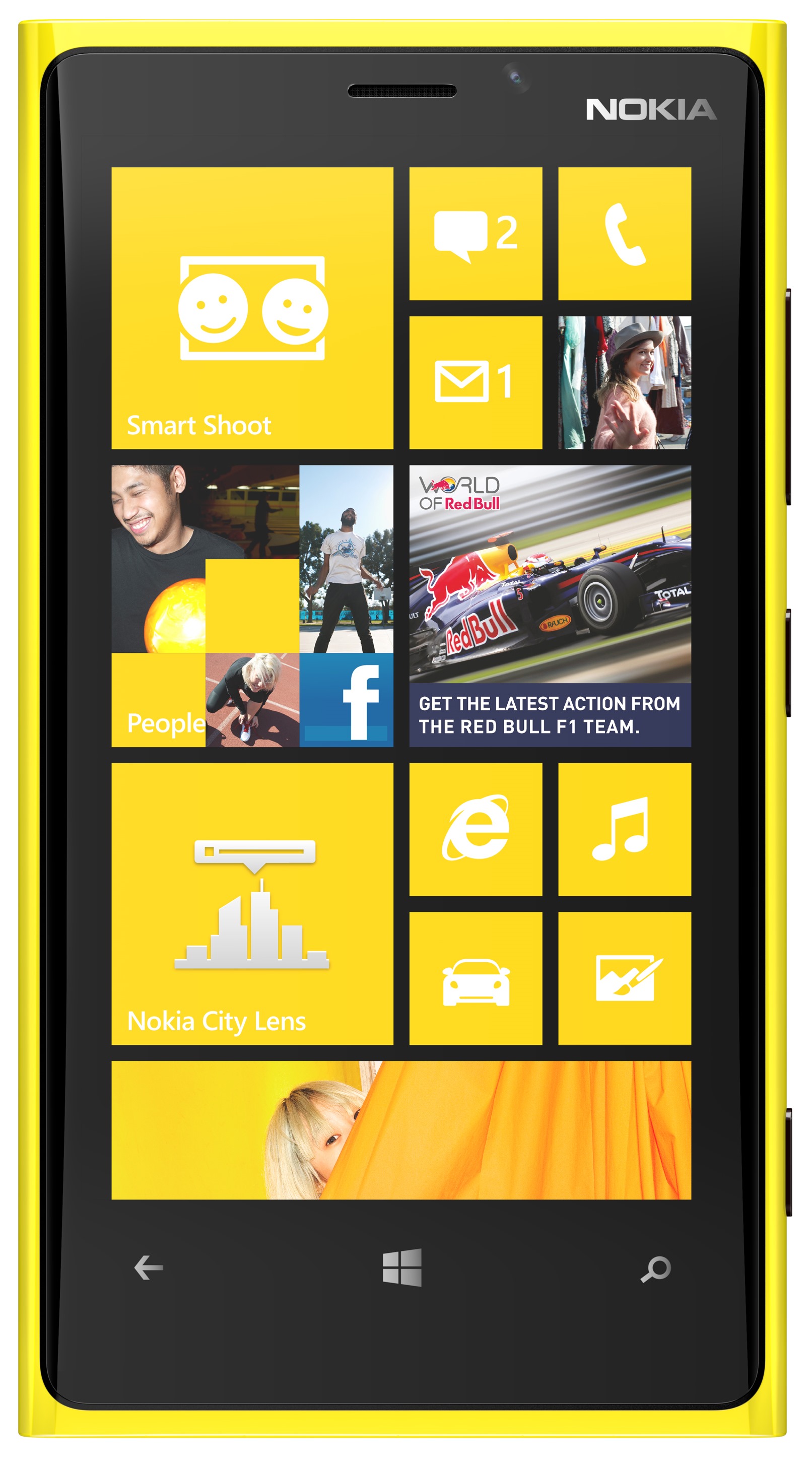 In case you are starting to get bored of looking at Android phones, let’s take a look at Windows Phone 8. Windows Phone 8 has a very unique user interface. All the Windows Phone devices seem to be pretty similar, as they all run on the same software. However, I think the Nokia Lumia 920 provides the best experience of Windows Phone 8, mainly because of the screen size.
This phone has a 4.5-inch display with a resolution of 1280×768. This means that you get the combination of a fairly large screen, an incredibly high pixel density and easy enough one handed use. This phone comes in several different colours, including red, blue, yellow, white and black, to stand out from other smartphones.
One small touch found with all Windows Phone devices is a dedicated camera button. I don’t know why you don’t get this on the iPhone, or even most Android devices. This isn’t a big deal for most users, but it is weird and slightly annoying to see that only Microsoft thought to include a camera button as a hardware requirement for Windows Phone.
Like all phones, the Nokia Lumia 920 also has its share of flaws. The corners of the phone aren’t rounded, which will make it awkward to hold the phone from the top or bottom ends. Some people don’t like the user interface of Windows Phone, and even my dad says this look and feel reminds him of Ikea.
Apart from that, this phone is currently exclusive to EE in the UK. They are currently the only 4G LTE network, but because of that, they have the most highly priced data plans, including £41/month for 1GB of data. This defeats the purpose of LTE. This technology is there so we can stream movies to our phones during long train journeys without stutter or lag, but on average, just one movie will eat up all your mobile data allowance for that month.
In conclusion, there are many devices to choose from. All these phones will work just fine for the average user, with the iPhone being the best for that overall. However, the Nexus 4 and Galaxy Note II are the best phones for hackers, developers and power users. The Optimus L3 is good for average users on a budget, and the One S is good for people who only care about the look and feel of the software. The Nexus 4 is my favourite of those six devices, and it is the phone I’m getting.
Posted on Wednesday 19th December 2012 - Leave a comment
 The mobile devices we use to call people today are nearly always referred to as phones. However, over the last few years, they have evolved well beyond that. They are now essentially pocket computers.
Since the release of the iPhone, nearly all smartphones have desktop grade internet browsers and screens with resolutions similar to the screens on our computers. So, where do we draw the line between phone and computer?
One feature phones have always had is the ability to make phone calls. However, computers can also make phone calls. In fact, they can make video calls. All they need is Skype.
One common aspect of all mobile phones today is that they fit in your pocket. However, there are several reasons for that not to be the categorising factor of a phone.
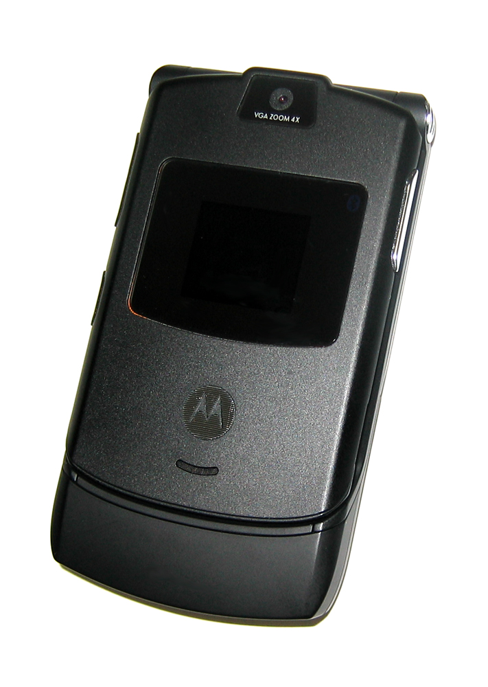 Not all phones are able to fit in pockets. Phones in the 1980’s were big, heavy and had external antennas. Nobody uses those phones today, and the car batteries inside them are probably a safety hazard. However, they are still phones.
There are many other objects that can fit in your pocket. These include tablets, credit cards, candy bars, TV remotes, and many other objects. Anything you can shove in your pocket. This also includes MP3 players.
With the thought of MP3 players in mind, we should be asking another question. Why is the iPod Touch categorised as an MP3 player? It can do everything an iPhone can do, with the exception of reading a SIM card.
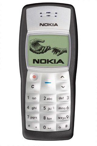
So far, the only real categorising factor of phones is the earpiece at the top. All phones have them, and it is used for listening to the person on the other end of the call. However, that can’t define what a phone is. We never really have to use that earpiece on modern phones, and there is a good chance manufacturers will stop building it into their future phones.
I think mobile devices should be recategorised. I think we should rename smartphones to ultraportable computers and put them in the same category as the iPod Touch. However, for now, average users will probably continue to think of their devices as what they evolved from.
Posted on Thursday 6th December 2012 - 1 comment
 Android 4.2 is Google’s next major release of Android. Like the last major release, Android 4.2 is still being called Jelly Bean. However, there are plenty of improvements with this revision of Android for it to be called an update. Android 4.2 is currently available on the Nexus 10, Nexus 7, Nexus 4 and Galaxy Nexus.
Google try to keep a consistent user interface on their Android phones and tablets. In early 2011, Google released Android 3.0 Honeycomb with a completely different user interface for tablet devices. That user interface is still used on many Android tablets today and I think it works better on larger displays. However, what Google are doing now will be less confusing to the average user, and to their credit, Google are making some changes to the user interface to make it less like that of a stretched out smartphone.
One key problem with Android is lag. Android doesn’t seem as smooth as iOS. This is because there are hundreds of Android devices, all with different hardware configurations. Google can’t just optimise Android to run smoothly on all devices with Processor A inside, because it will then perform poorly on a device with Processor B. Google have tried to fix that in Android 4.1 and above with Project Butter, but they still aren’t quite there yet. The key problems at the moment are multitasking lag and the slight delay with touch responses.
There are three main features Google have added to Android 4.2. Google have added lock screen widgets which can be accessed from a swipe down from the large clock, and with left and right swipes to move between different widgets. At the moment, there are only a few Google widgets that are available on the lock screen. However, third party widget support will probably be added very soon.
The second feature added in Android 4.2 is a set of quick settings in the notification panel. The quick settings panel can be accessed on tablets by swiping down on the right side of the notification bar. It can be accessed on smartphones with a two finger swipe on the notification bar, or a one finger swipe and a tap on an icon in the top right corner. However, those quick settings can’t be customised, and I prefer having the buttons for quick settings above my notifications. I expect Google will add options to customise this in a future release of Android.
The third feature Google have added is multiple user support for tablets. This is good for families who buy a tablet device to share. Each user can have their own high scores in the games they like, and they will no longer have to log out of each other’s social networking accounts. However, it would have been nice to see that feature on smartphones. It was left out because smartphones are more personal, and they sometimes have less storage. However, young children generally don’t have smartphones and like to play games on their parent’s phone.
One thing I should point out is that Google decided not to release Android 4.2 for the Nexus S or the Motorola Xoom. It has not been confirmed yet whether Google have completely dropped support for those devices, but that is what it looks like. If this is true, it will be a shame. Both those devices definitely have the hardware required for Andriod 4.2 and will be seeing unofficial ports to Android 4.2 in the near future. However, I think that all mobile devices should get at least 3 years of official software support.
Overall, Android is fine for the average user. Besides the lag, Android is fairly easy to use, and the user interface is both simple and very functional. An Android device can do most, if not all of what you will want to do on an iPhone and in some cases, an Android device will only cost a 10th of the price. However, smart people will know the best smartphone on the market will cost them more than £50. Hopefully, they will buy a Nexus device and get updates and performance improvements as soon as they are released.
UPDATE: I have since found out that Android 4.2 already has support for third party lock screen widgets. Some developers have integrated third party widgets into their apps.
Posted on Tuesday 27th November 2012 - Leave a comment
« Previous Page — Next Page »


 I chose the Nexus 4 over another smartphone for quite a few reasons. I chose it over an iPhone 5 because of how open it is to developers, and I chose it over an HTC One S for the attention it will get from the developer community. The on screen buttons are also pretty cool.


 First, let’s look at the iPhone 5. This is one of the biggest changes Apple has made to the iPhone. The first thing you will notice is the larger display, compared to all previous iPhone generations. This phone is incredibly light and feels great in the hand. The power button is a bit hard to reach, as it is on the top of the phone. However, this is the only real design flaw.
 The LG Optimus L3 is by no means a power house. It has a single-core 800 MHz processor and 384 MB of RAM. Not to mention, this phone has a QVGA 320×240 screen. However, it should be just fine for a first time smartphone user. You could probably get hold of this phone for under £50, if you know where to look.
 If you don’t care about the latest version of Android, and you just want high quality hardware that will last a while, you may want to consider an HTC One S. It has an aluminium unibody design and an excellent camera that can shoot video and take pictures at the same time.
 If you don’t care about look and feel, and you just want a phone with as much functionality as possible out the box, you may want to consider the Samsung Galaxy Note II. This phone has a massive 5-inch 720p display and software to take advantage of the screen size.
 In case you are starting to get bored of looking at Android phones, let’s take a look at Windows Phone 8. Windows Phone 8 has a very unique user interface. All the Windows Phone devices seem to be pretty similar, as they all run on the same software. However, I think the Nokia Lumia 920 provides the best experience of Windows Phone 8, mainly because of the screen size.
 Not all phones are able to fit in pockets. Phones in the 1980’s were big, heavy and had external antennas. Nobody uses those phones today, and the car batteries inside them are probably a safety hazard. However, they are still phones.
 Android 4.2 is Google’s next major release of Android. Like the last major release, Android 4.2 is still being called Jelly Bean. However, there are plenty of improvements with this revision of Android for it to be called an update. Android 4.2 is currently available on the Nexus 10, Nexus 7, Nexus 4 and Galaxy Nexus.