Alternative Android Twitter Clients
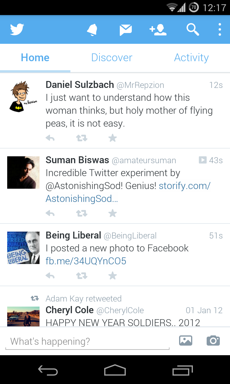 Twitter recently released a new update to their official Android app, and if I’m being honest, I don’t like it. It is awful. It is ugly, and navigating around it is an absolute nightmare. They tried to shove too many buttons in the action bar, and they replaced the “interactions” and “profile” tabs with “discover” and “activity”, sections that I never use.
I decided to stick with this redesign while it was in its beta stages because I thought they were just experimenting with different layouts, but when they released that layout in an official update, I had to switch to a third party Twitter client to stop my head from exploding. I could go on about why this design is bad, but I think 2 paragraphs is enough.
This is the first app I tried when Twitter released their redesigned app.
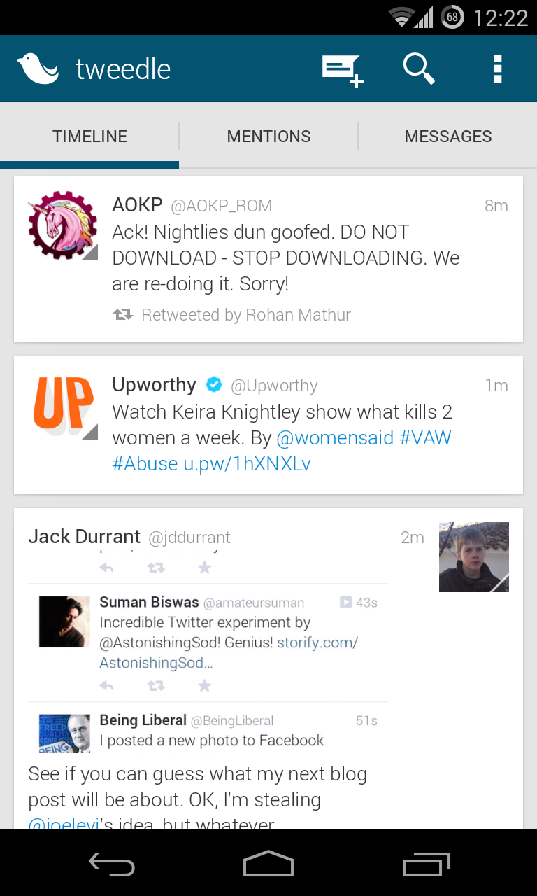
Tweedle sticks to the Holo design guidelines really closely, which is great if you’re like me and treat those guidelines as a religion. This app presents each tweet in its own card, a lot like Google Now, and it has Gmail’s swipe to refresh animation.
Tweedle also comes with a bit of customisation. You can change the background and accent colours of the app and change the tabs you see on the main screen. On top of that, Tweedle is super smooth.
Although I like Tweedle, there are a few small problems I have with it. First of all, it has one of the ugliest icons I’ve ever seen. This may seem like a small problem, but I don’t want to see an ugly icon every time I look at my home screen.
When I reload the timeline or post a new tweet in Tweedle, it shows a notification on top of the action bar, not allowing me to search for tweets or compose a new tweet until after a few seconds, when the notification disappears. This isn’t a real problem, but it could be easily solved by replacing that notification with a toast notification near the bottom of the screen.
The third problem with Tweedle is a problem I see with most Android apps. The main actions of the app are at the top of the screen, and you’ll see why this is a problem if you have a phone with a 5″ screen. I would like to see more apps with navigation right at the top of the screen and main actions at the bottom.
Carbon is basically the opposite of Tweedle. Although it follows the basic Holo design guidelines, it takes a bold departure from the Holo look and feel. I like it.
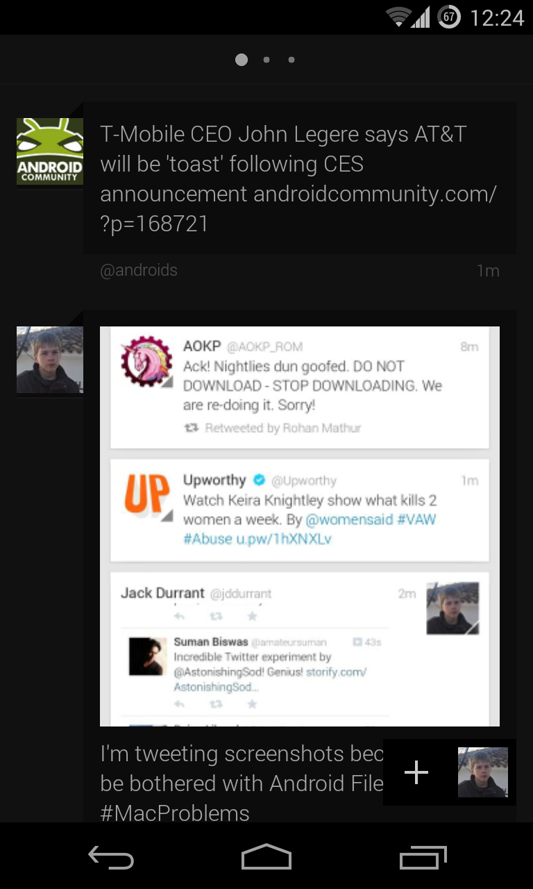
In place of tabs for navigation, Carbon presents 3 dots at the top of the screen, similar to home screen dots on the Nexus 5, for the 3 main pages in the app; Timeline, Mentions and Direct Messages.
Carbon displays a lot of 3D animations for different swipe gestures. For instance, when you swipe down to refresh a feed, the whole screen tilts backwards. Carbon probably isn’t the app for people who like minimalistic designs.
If I could change one thing in Carbon, I would move the “new tweet” button and profile picture to the bottom left corner. I would also like to see a better icon, although the icon it has at the moment looks way better than the icon for Tweedle.
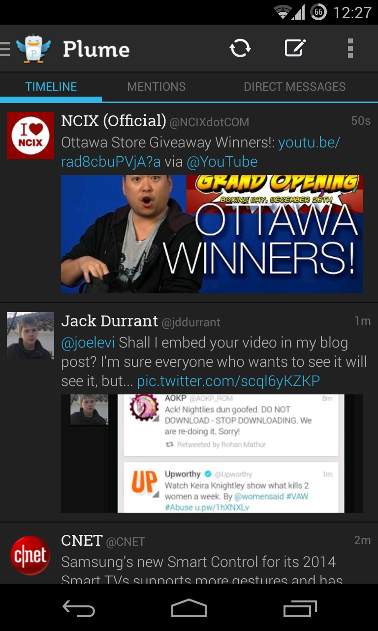
Plume is probably one of the more full featured Twitter clients available for Android, and it is the only Twitter client in this blog post that includes Facebook integration. I can put up with the official Facebook app for Android, but if you can’t, this feature might be enough to convince you to switch.
Plume is also one of the more customisable Twitter clients available for Android. You can change what tabs you see on the main screen, colour code individual tweets in your timeline and add a striped background to the “mentions” screen.
Although I really like the look and feel of Plume, I’m not a big fan of its functionality. The tabs at the top are duplicated in the navigation drawer, and there is a timeline refresh button that could easily be replaced by a search button. Finally, Plume just doesn’t feel as smooth as the other Twitter clients.
I would happily use any of the third party Twitter clients in this blog post over Twitter’s official Android app at the moment. They all have great looking user interfaces, and they mostly have logical layouts. Then again, beating the official Twitter app isn’t exactly difficult at the moment.
Tweedle is great for people who like apps that follow the Holo design guidelines. Carbon is good for users looking for something a bit different, and this is the app I use at the moment. Plume is a great looking app, although I think you have to be a long time user to appreciate it at this point. What Twitter client do you use?
Posted on Saturday 4th January 2014 - 1 comment